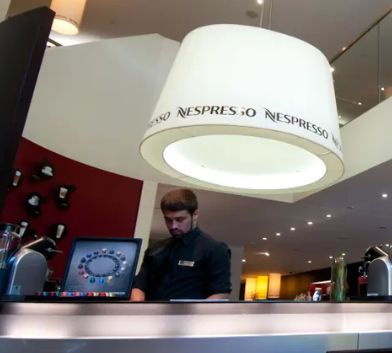
When you ordered capsules, you joined the “Club”, which also meant handing over your contact information.
訂購膠囊咖啡機后,你就成為俱樂部的一員,這也意味著給出你的聯系信息。
Over time, Nespresso gained a huge database of customers it could market to, as well as a way of recording consumer preferences and buying habits.
久而久之,奈斯派索擁有了一個很大的數據庫,里面都是可購買其產品的消費者,還掌握了一種記錄消費者偏好和購買習慣的方法。
For customers, the club created the sense that you were part of a sophisticated worldwide cabal of corporate espresso lovers.
對于顧客來說,這家俱樂部給人的感覺是,你是一個精致的全球濃縮咖啡愛好者集團的一部分。
When I first encountered Nespresso, as a student, around 2006, I remember feeling like I was finally part of the global elite everyone kept complaining about.
大約在2006年,作為學生的我第一次接觸了奈斯派索膠囊咖啡。我記得我感覺自己終于成為了人人都在抱怨的全球精英中的一員。
“What Nespresso have done is create a lot of benign bullshit around coffee,” said Rory Sutherland. “But people enjoy the bullshit.”
“膠囊咖啡機帶來的就是很多關于咖啡的善意的胡扯,”羅里·薩瑟蘭說。“但人們喜歡胡扯。”
At the University of Oxford, Prof Charles Spence, head of the Crossmodal Research Lab, has studied how much your experience of coffee is shaped by the way it is presented.
在牛津大學,跨模態研究實驗室主任查爾斯·斯賓塞教授研究了咖啡的呈現方式對你的咖啡體驗有多大影響。
In Nespresso adverts, he observed, coffee is almost always displayed in a transparent glass, with a crown of light crema on top of the drink.
據他觀察,在雀巢的廣告中,咖啡總是裝在一個透明的杯子里,上面有一層畫龍點睛的淡淡的克麗瑪泡沫。
“It starts to look almost like a pint of Guinness,” Spence said.
斯賓塞說,“它開始看起來就好像是一品脫的吉尼斯黑啤。”
“Coffee doesn’t come with the visual variation you get in tea or wine –
“咖啡不會呈現茶或者酒那樣的視覺變化,
it’s all pretty much the same colour, so perhaps you have to show it with the crema.”
它基本上都是同一個顏色,所以或許你只能在克麗瑪泡沫上面展示它的不同之處。”
(The crema is key to the mythology of espresso. Legend has it that the Italian company Gaggia coined the term in the 30s,
(克麗瑪泡沫是濃縮咖啡神話的關鍵。據說,意大利公司加吉亞在30年代創造了這個詞,
rebranding something customers had previously thought of as “scum” on the top of their drink as “caffe creme”, a coffee so fine it made its own froth.)
將顧客之前認為咖啡上面是“浮渣”的東西重新命名為“咖啡克麗瑪”,這種咖啡非常好,可以自己產生泡沫。)

For the people who sell it, the way coffee looks has long been as important as how it tastes.
對于銷售咖啡的人來說,長久以來,咖啡的外觀和口味同樣重要。
Until the late 19th century, beans were prized for their size, colour and symmetry.
直到19世紀晚期,人們還因咖啡豆的大小、顏色和對稱性來定價。
Nespresso applied a similar approach to its capsules: they started rather plain, in greys and golds, but evolved into a full spectrum.
奈斯派索對其膠囊咖啡產品也采用了類似的方法:開始的時候非常普通,只有灰色和金色的,但逐漸發展成為全系列的。
Red means decaffeinated, with darker purples and greys for the stronger, more intense flavours.
紅色代表無咖啡因,深紫色和灰色代表更強烈、更強烈的口味。
“You are trying to give people visual clues about the origins of the product,” said Spence.
斯賓塞說,“你要試圖給人們呈現關于產品起源的視覺線索。
“People prefer the taste of things when they think they have made a choice about it.”
人們在感覺到自己做了一個選擇后,會更喜歡這個東西的味道。
The Nespresso system made every customer feel like a connoisseur:
奈斯派索膠囊咖啡系統讓每位顧客都感覺自己是內行:
you had to make a choice every time you put a capsule in the machine, even if it was just between black or purple.
每次往機器中放膠囊時,你都得做出一個選擇,即使僅僅是在黑色和紫色之間做選擇。


