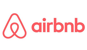
Vacation rental service Airbnb unveiled a new logo last week that generated a wave of criticism for its design. Some likened it to a triangular paperclip or, even more crudely, to certain female anatomy.But the company still stands by the logo, which it calls Bélo and says represents belonging. “It’s a symbol for people who want to welcome into their home new experiences, new cultures, and new conversations,” Airbnbsaid on its blog. Well, maybe if you squint.
度假公寓租賃服務(wù)網(wǎng)站Airbnb上周發(fā)布的一個(gè)新logo引來了不少人的批評(píng)。有人說它像一枚三角型的曲別針,更無節(jié)操者甚至說它像是女性的某個(gè)器官。但是Airbnb公司仍然支持這個(gè)logo,該公司把它稱做Bélo,并稱它象征著歸屬感。Airbnb在其官方博客上稱:“它是一個(gè)象征,代表了那些想要在家中獲得新的體驗(yàn)、感受新的文化、開啟新的對(duì)話的人。”大概只有斜視眼才能看得出來吧。
As to be expected, branding experts aren’t exactly thrilled by the design. Their verdict: Why futz with something that seemed to work just fine.
在Airbnb發(fā)布新logo的背景下,《財(cái)富》也收集了另外幾家公司選用了失敗的logo的案例——至少人們的主流觀點(diǎn)都認(rèn)為這些logo是失敗的。現(xiàn)將這些例子羅列如下:
Gap
Gap
Date released: 2010
發(fā)布日期:2010年
Lifespan: A week
壽命:一個(gè)星期
Clothing store Gap tried to recast its image from "classic, American design to modern, sexy, cool," a company spokesperson said at the time. That ended in failure, however. The retail store has always been known for the elegant and elongated letters of its font. But it switched to lowercase black letters with an awkwardly placed blue box atop the letter.
當(dāng)時(shí)服裝商店Gap的一名發(fā)言人曾表示,Gap想把它的形象從“經(jīng)典美國(guó)設(shè)計(jì)”改變?yōu)椤艾F(xiàn)代、性感、酷”。但是這種改變最終以失敗而告終。Gap一直以logo上典雅的瘦長(zhǎng)字體為人所知,但是后來它把logo改成了黑色的小寫字體,最后一個(gè)字母上還有一個(gè)尷尬的藍(lán)塊塊。
JCPenny
JCPenny
Date released: 2012
發(fā)布日期:2012年
Lifespan: A year
壽命:一年
For JCPenny, the logo woes were many. In fact, the company switched up its design every year for four years. In 2011, it threw out its classic logo for another featuring lower case letters and a red box. It then held a competition for a new design. The winner? A lowercase "jcp" in a blue box, bordered by a bigger red box. The tweak didn't make customers happy, however, and they changed the design back a year later (having also changed the logo a year before that in 2011). Of course, all these redesigns came as the company stumbled financially, capped by a $550 million loss in the fourth quarter of 2012.
對(duì)于JCPenny公司來說,有關(guān)logo的苦水著實(shí)不少。這家公司曾經(jīng)在四年時(shí)間里,年年都換一次logo的設(shè)計(jì)。2011年,該公司丟棄了它的經(jīng)典logo,取而代之的是一串小寫字母和一個(gè)紅框框。然后它又舉辦了一場(chǎng)征集新設(shè)計(jì)的競(jìng)賽。最后勝出者,是把小寫的“jcp”三個(gè)字母放在一個(gè)藍(lán)塊塊里,外面圍著一個(gè)更大的紅框框。不過大概一年后,他們就改變了這個(gè)設(shè)計(jì)。當(dāng)然,logo接連變換的同時(shí),該公司的經(jīng)濟(jì)狀況也是步履蹣跚。2012年第四季度,JCPenny報(bào)虧5.5億美元。
Starbucks
星巴克
Date released: 2011
發(fā)布日期:2011年
Lifetime: Still alive
壽命:至今健在
Starbucks switched its logo to something simpler to celebrate its 40th anniversary. The company added a lot of green to the design and removed the "Starbucks Coffee" phrase that had wrapped around the company's signature symbol - a siren. CEO Howard Kurtz said that the mascot had "been through it all" over the last four decades, and needed a "small but meaningful update." Reactions were initially mixed, although the criticism has since died down.
為了慶祝公司成立40周年,星巴克給自己換了一個(gè)更簡(jiǎn)潔的logo。首先是在logo里加入了很多綠色,其次是除去了“星巴克咖啡”的英文字樣。這串字母原本環(huán)繞在星巴克的招牌符號(hào)——女海妖的身邊。CEO霍華德o舒爾茨表示,這位女海妖在公司40年的風(fēng)雨歷程中“一直都在”,而且需要一次“雖然小但是有意義的升級(jí)”。消費(fèi)者的反映最初是褒貶不一,不過目前批評(píng)的聲音已經(jīng)淡去。(財(cái)富中文網(wǎng))


